After a four-month project, my work boosted user perception in key areas and received a standing ovation at the final presentation
40% Increase in Professionalism &
80% Increase in perceived youthful energy
Tenmin is an innovative AI language tutor that enables real-time conversational practice. The app provides immediate feedback on pronunciation, personalized lesson content, and interactive speaking exercises designed to build practical fluency faster than traditional language learning methods.
As UX Lead for Tenmin, I shaped the user experience and visual direction of this AI language learning app:
My work helped transform advanced language technology into intuitive experiences that feel approachable and encouraging to learners.
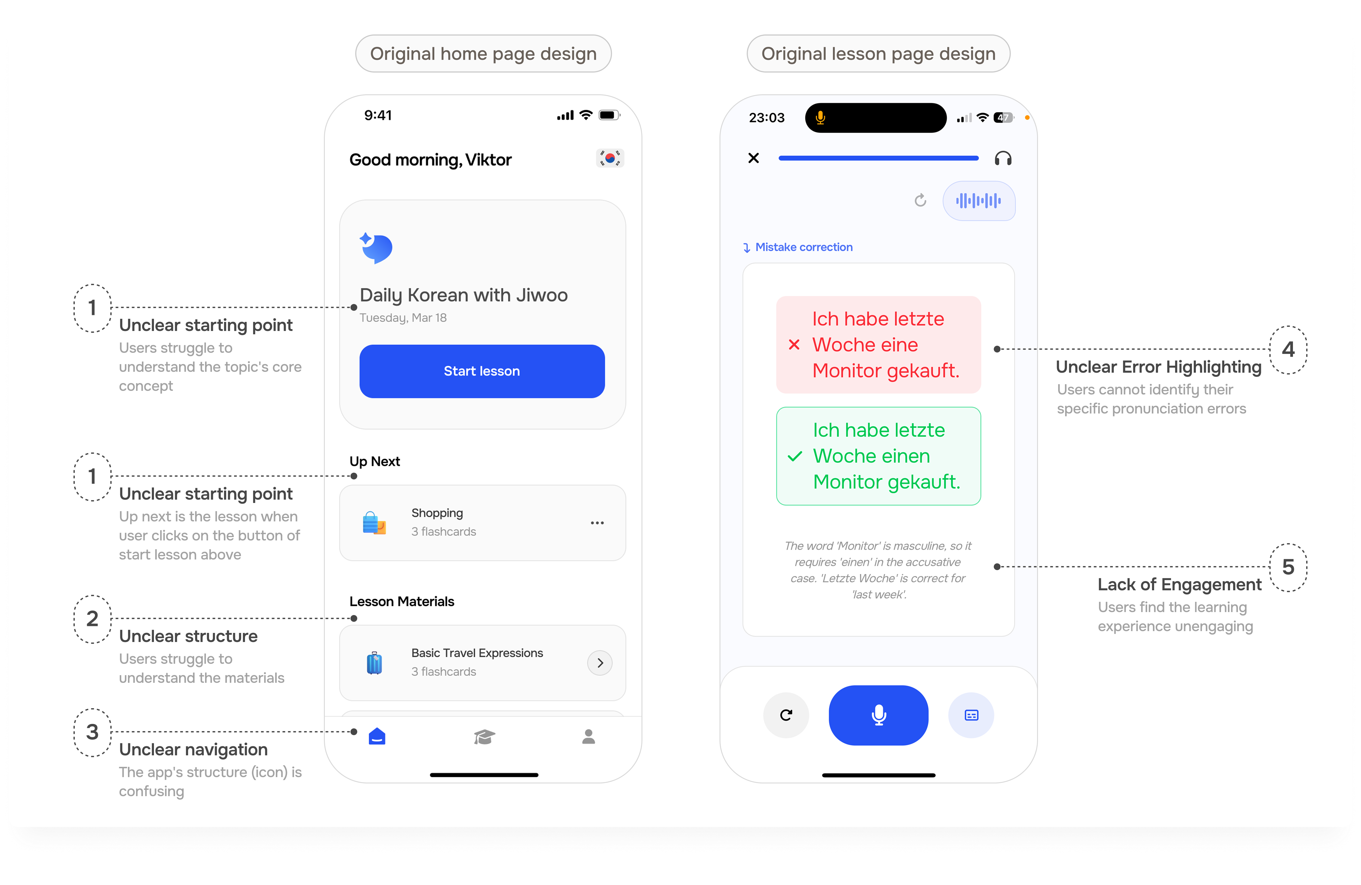
Users arrive on the homepage feeling lost. The lack of a clear structure makes it difficult for them to know where to begin, which creates friction and may cause them to leave.
Users find the learning experience unengaging and don't see the value in the AI tutor. The AI fails to provide guidance, leaving them unsure of how to improve their speaking skills.
Tenmin's design blends in with competitors instead of standing out, failing to communicate professionalism and decreasing user trust and motivation.
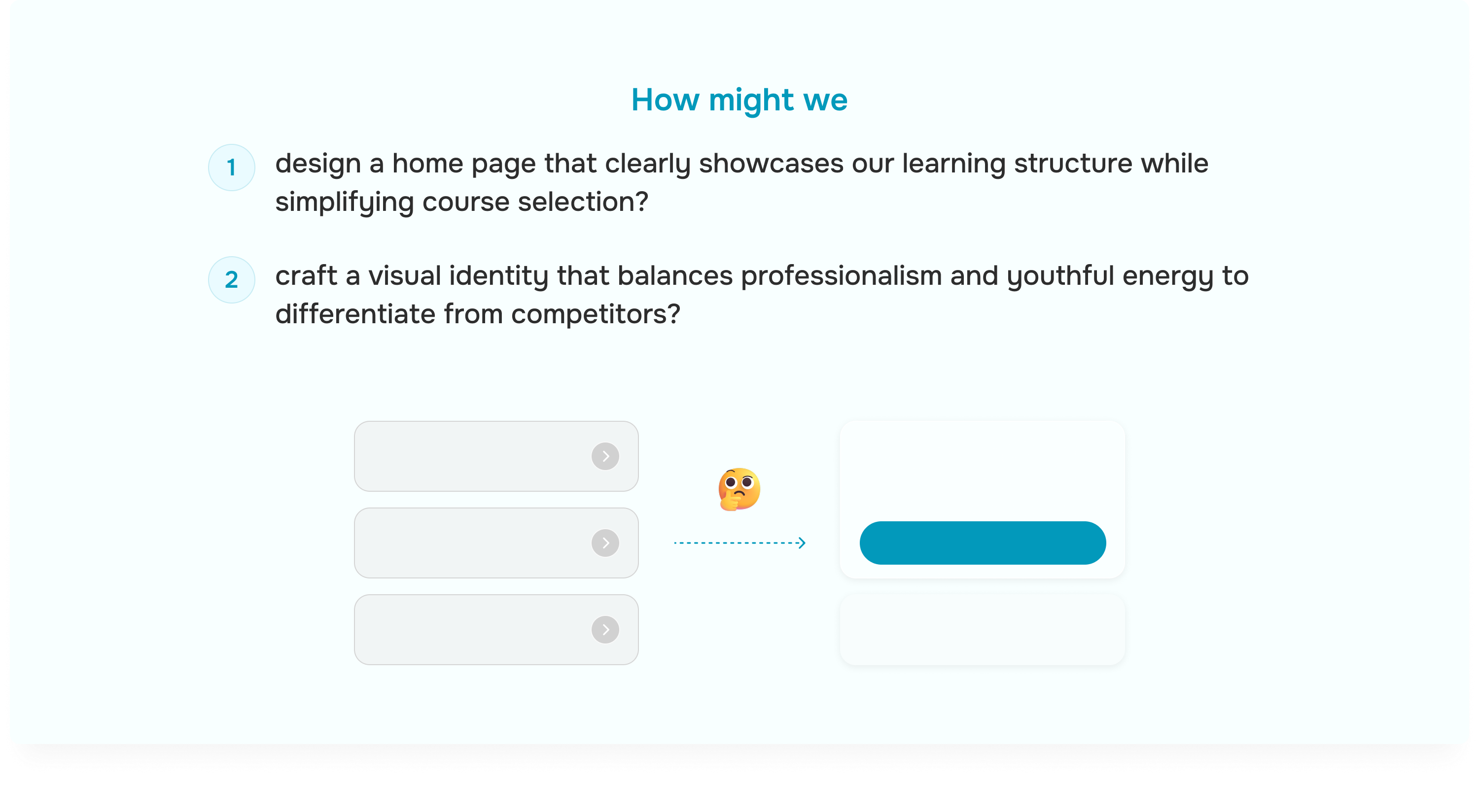
Based on the three core problems identified, we synthesized our findings into two focused How Might We questions that would guide our design solution and help the team concentrate efforts on the most impactful areas.
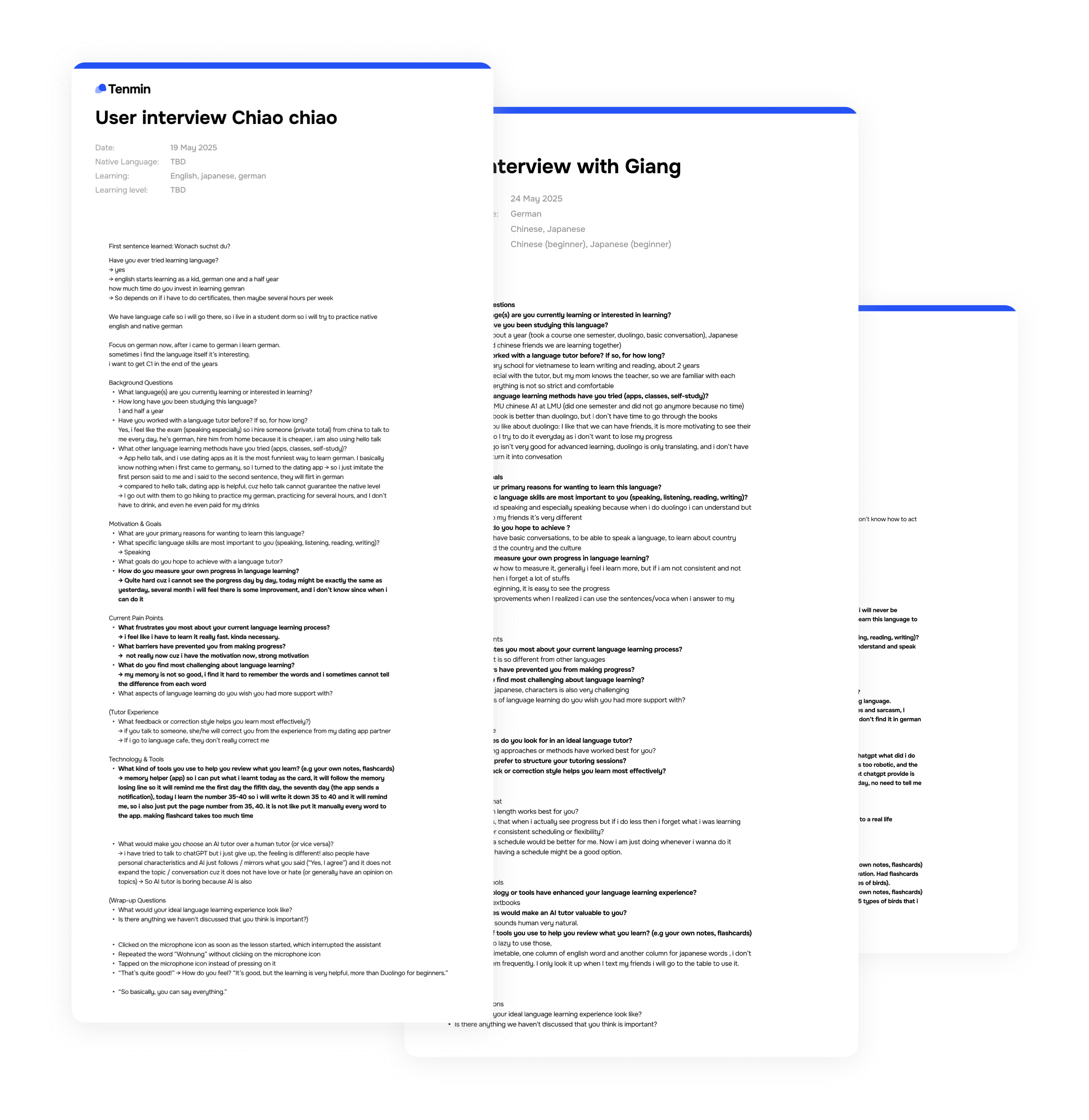
To build Tenmin with real users in mind, the whole team conducted in-depth interviews with 10 potential language learners from students mainly.
We explored their learning backgrounds, personal goals, current pain points, and preferences for tutoring.
This research helped us validate the core problems and informed our How Might We questions, ensuring our solutions addressed genuine user needs rather than assumptions.
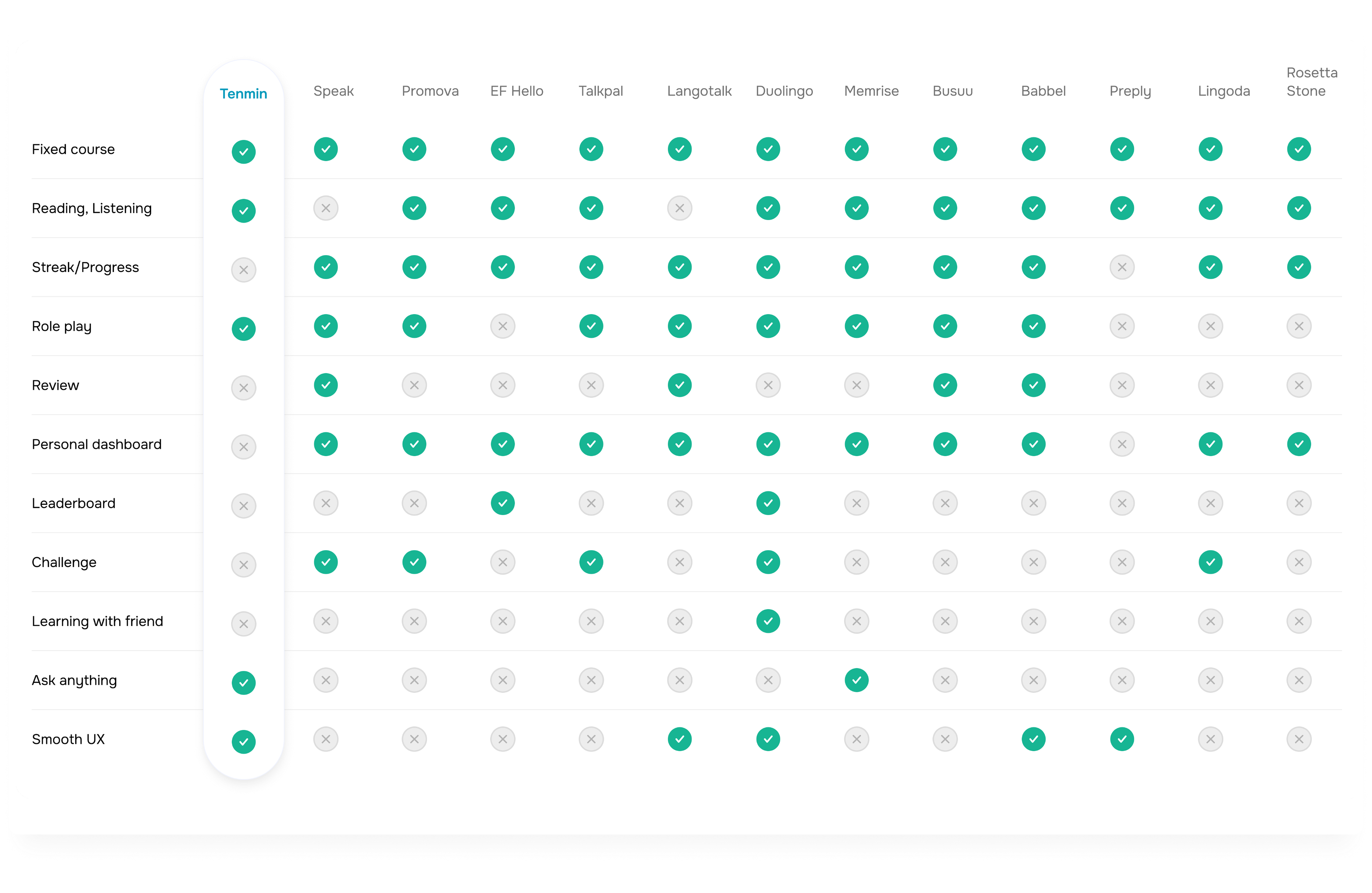
Mauricio and I analyzed 10 language learning apps to identify market gaps. We discovered that most competitors struggled with clear course presentation and relied on stress-inducing streak systems. However, apps with engaging AI characters built stronger user loyalty, while review methods remained generic across the market.
These insights guided us to prioritize intuitive course navigation and create a distinctive AI tutor experience.

Through competitor analysis, I developed a feature summary that identified both successful competitor offerings and potential focus areas where we could gain competitive advantage.
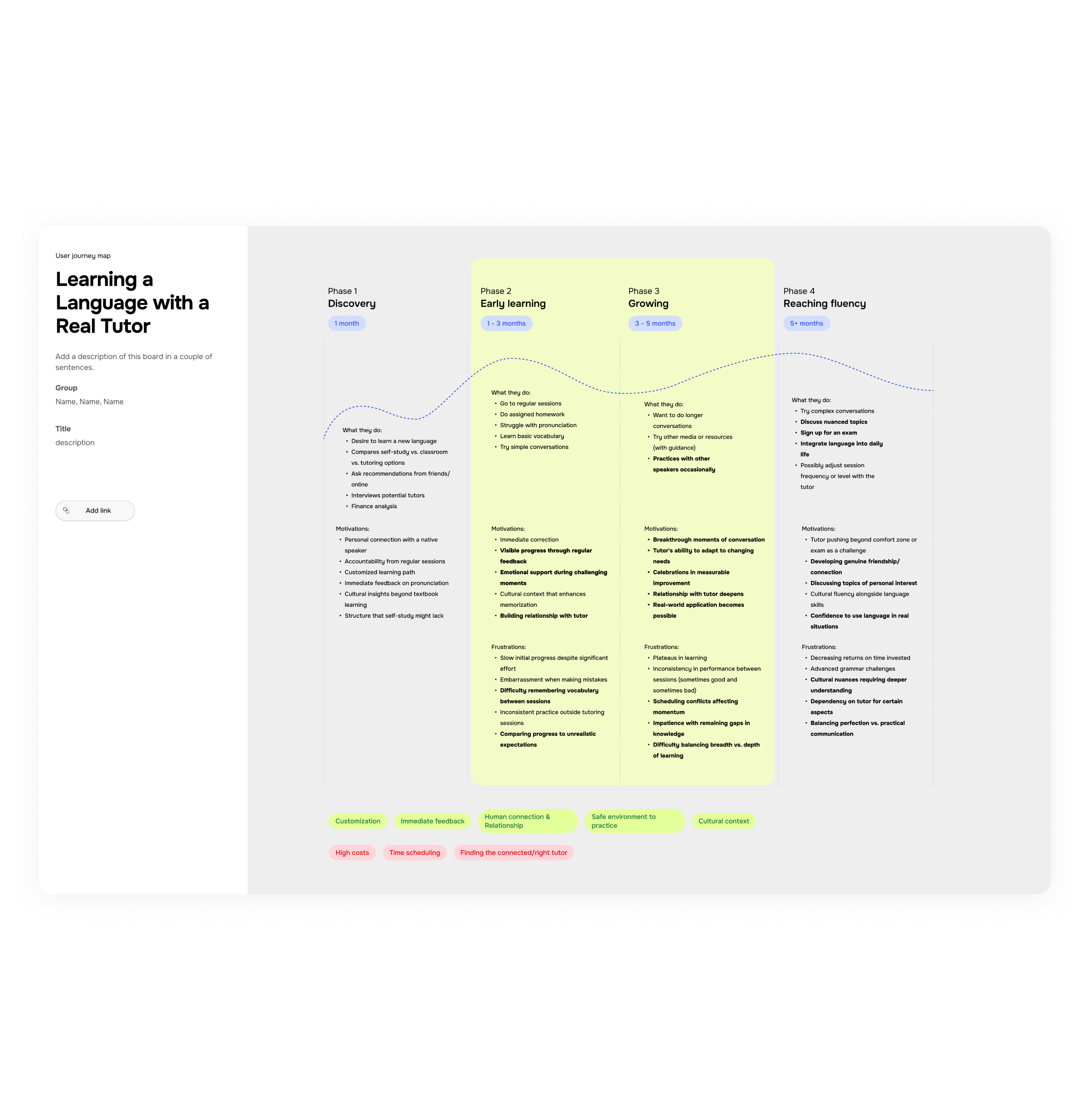
Following user interviews and competitor analysis, we mapped the user journey to understand how language learning needs evolve over time and proficiency levels.
For beginners (Phase 1-2), we discovered key motivations like personal tutor connections and immediate feedback, while frustrations centered on vocabulary overload and embarrassment.
Intermediate learners (Phase 3-4) seek for authentic conversations and real-world applications but struggle with invisible progress and balancing grammar with practical communication.
This mapping helped us focus exclusively on beginners and intermediate learners, aligning with the app's core vision.
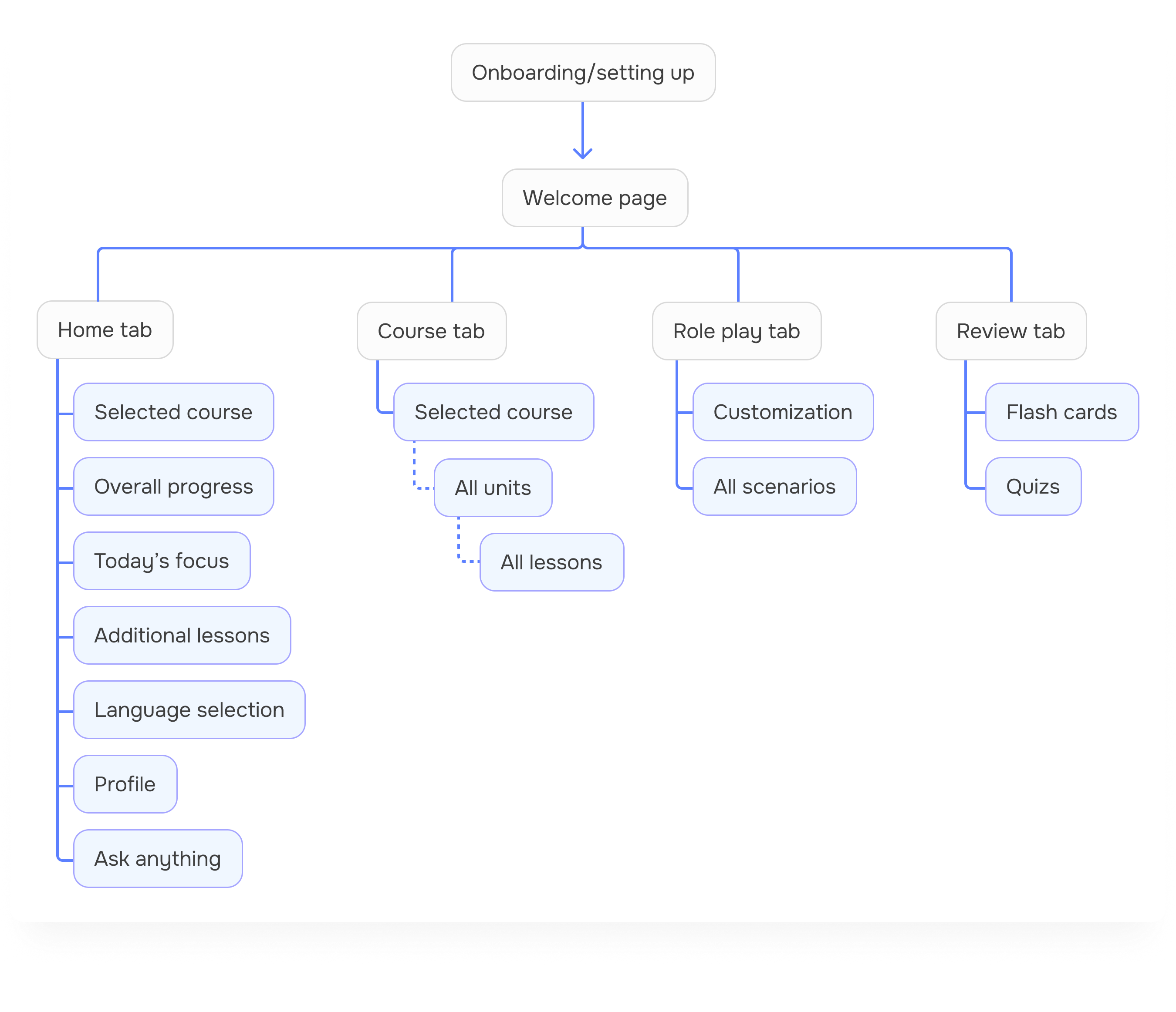
I developed an information architecture to address the key problems uncovered in our competitor analysis.
Our IA work prioritized logical content grouping and visual guidance, with flexibility to iterate based on user interview results.
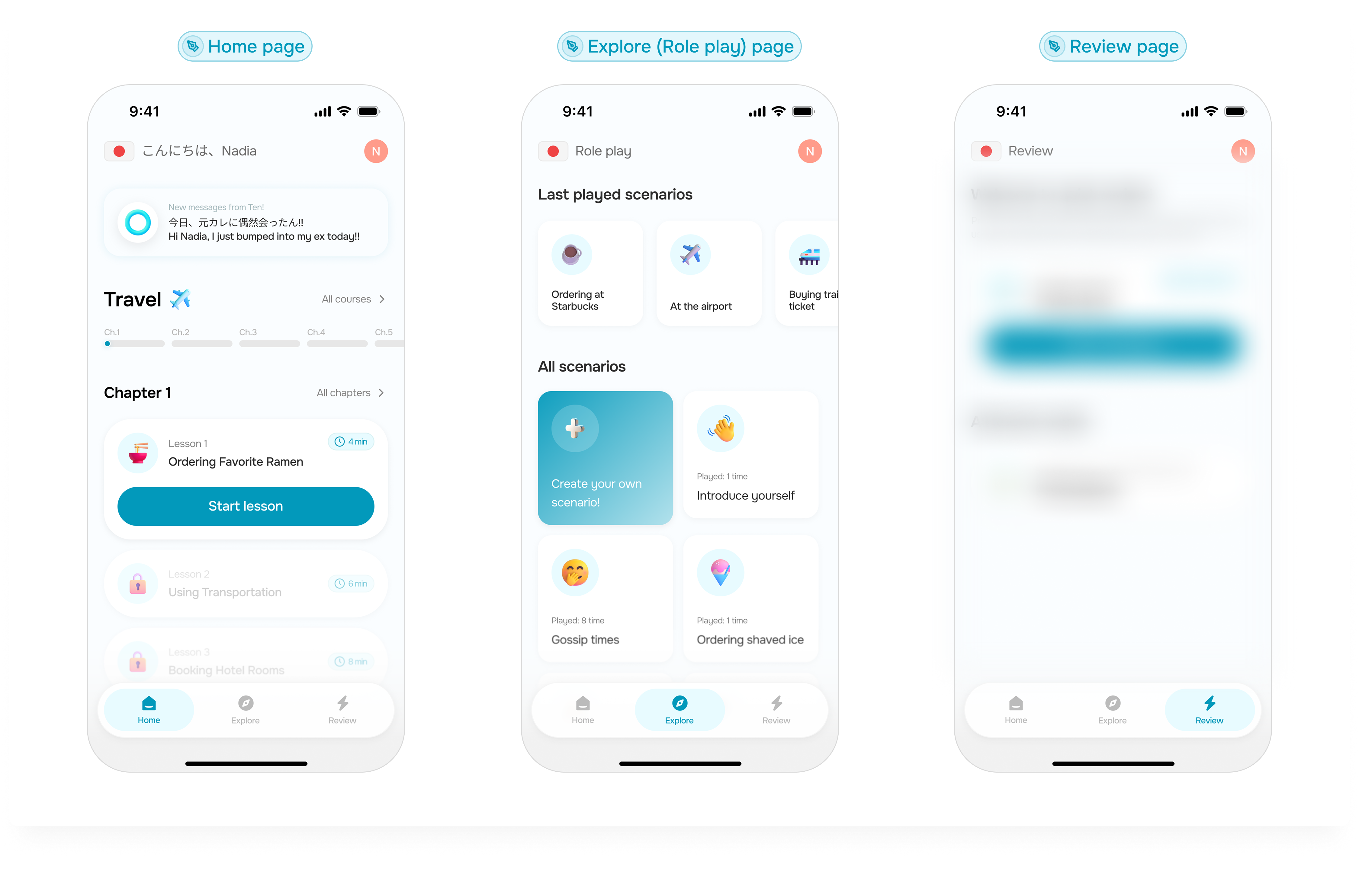
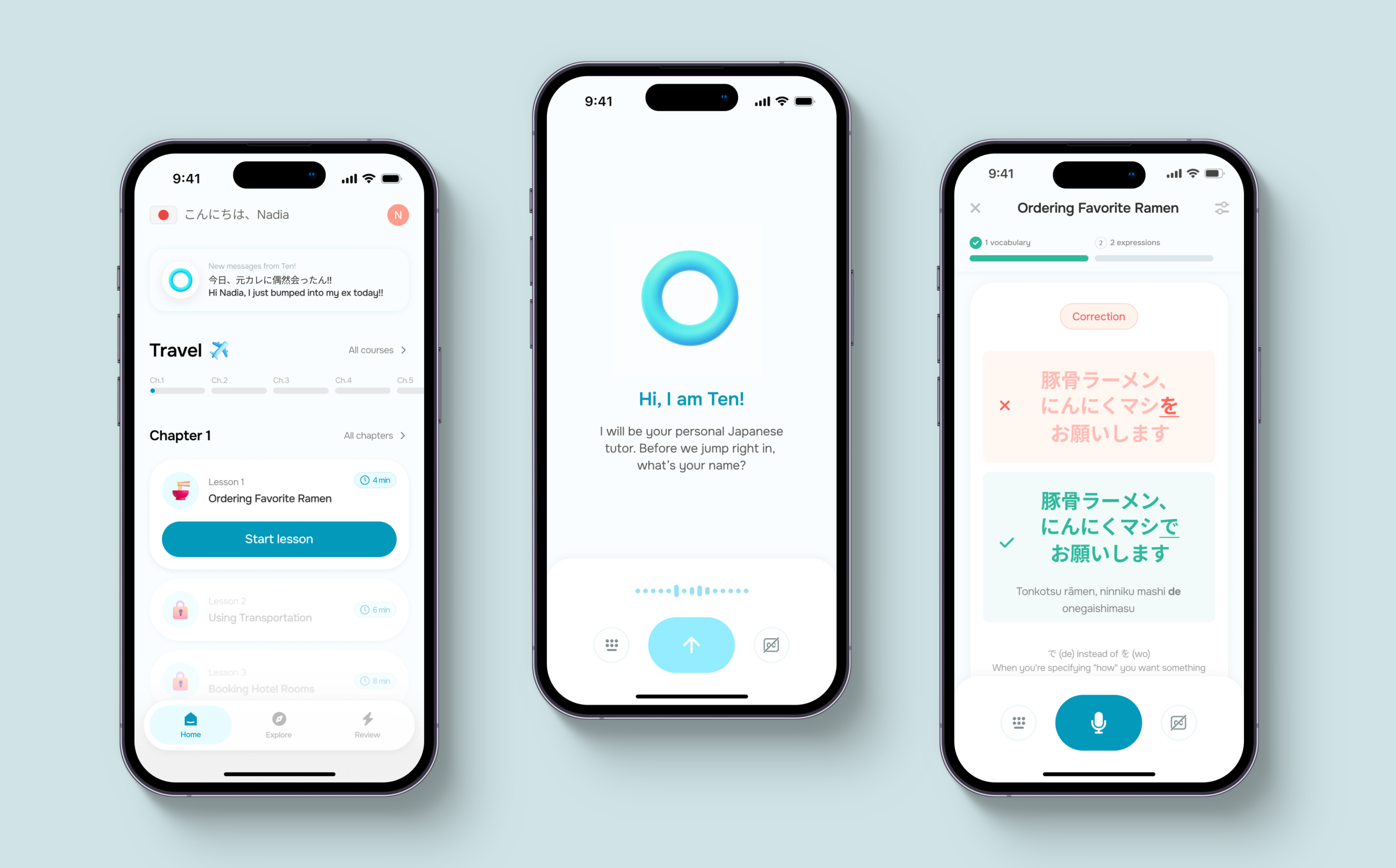
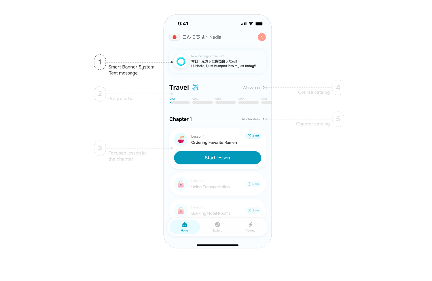
Before: The original home screen featured cluttered lesson cards with excessive information, creating decision paralysis and cognitive overload for users. Its design lacked the youthful energy central to our brand identity.
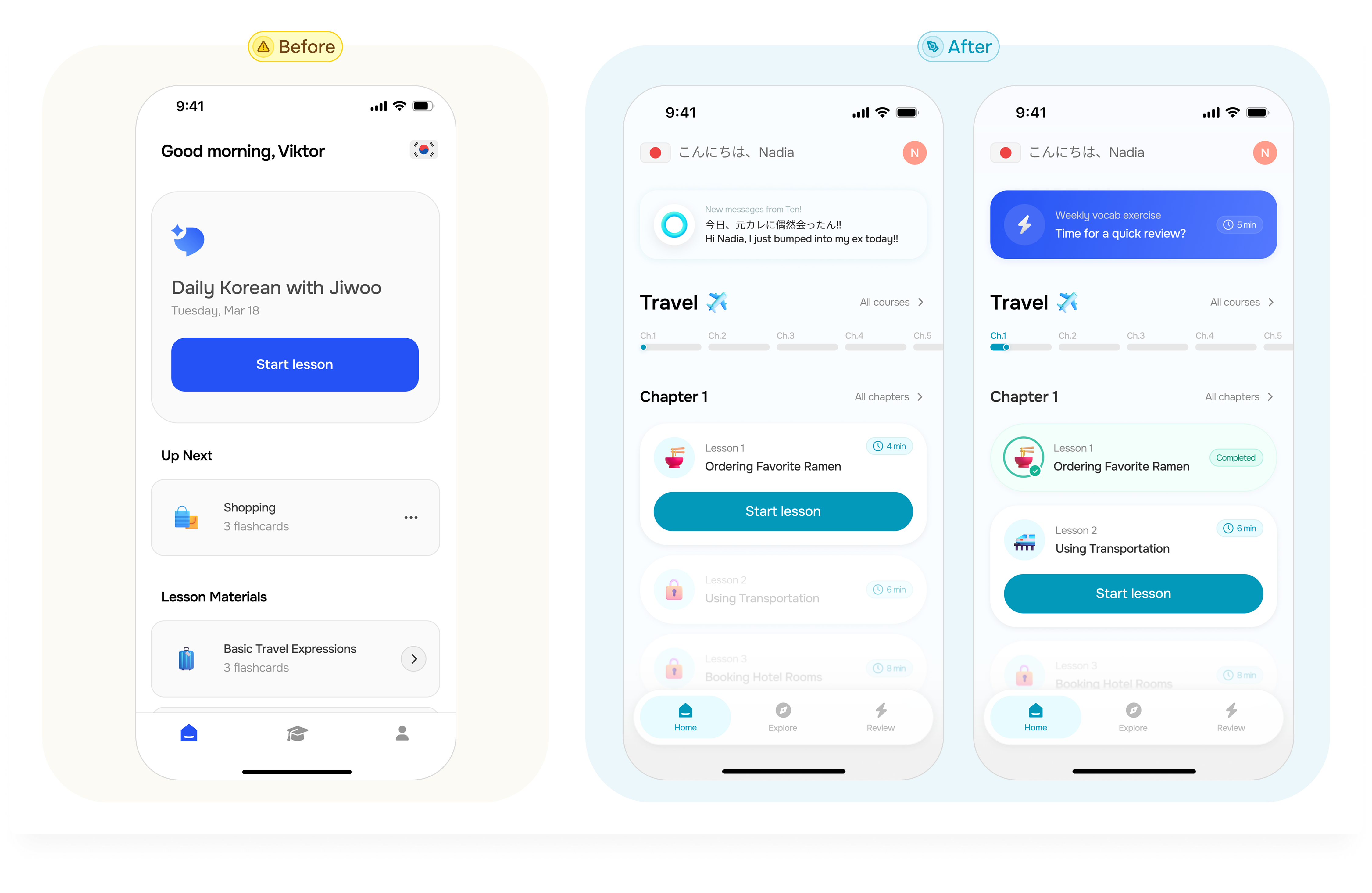
After: After three thoughtful iterations of the lesson card component with the Lead PM, Mauricio Rivero Pooley , our redesigned home page now presents a clean, intuitive interface that preserves minimalism while significantly reducing cognitive load. The streamlined design better aligns with our core brand concept: youthful and professional, while making course selection more approachable.
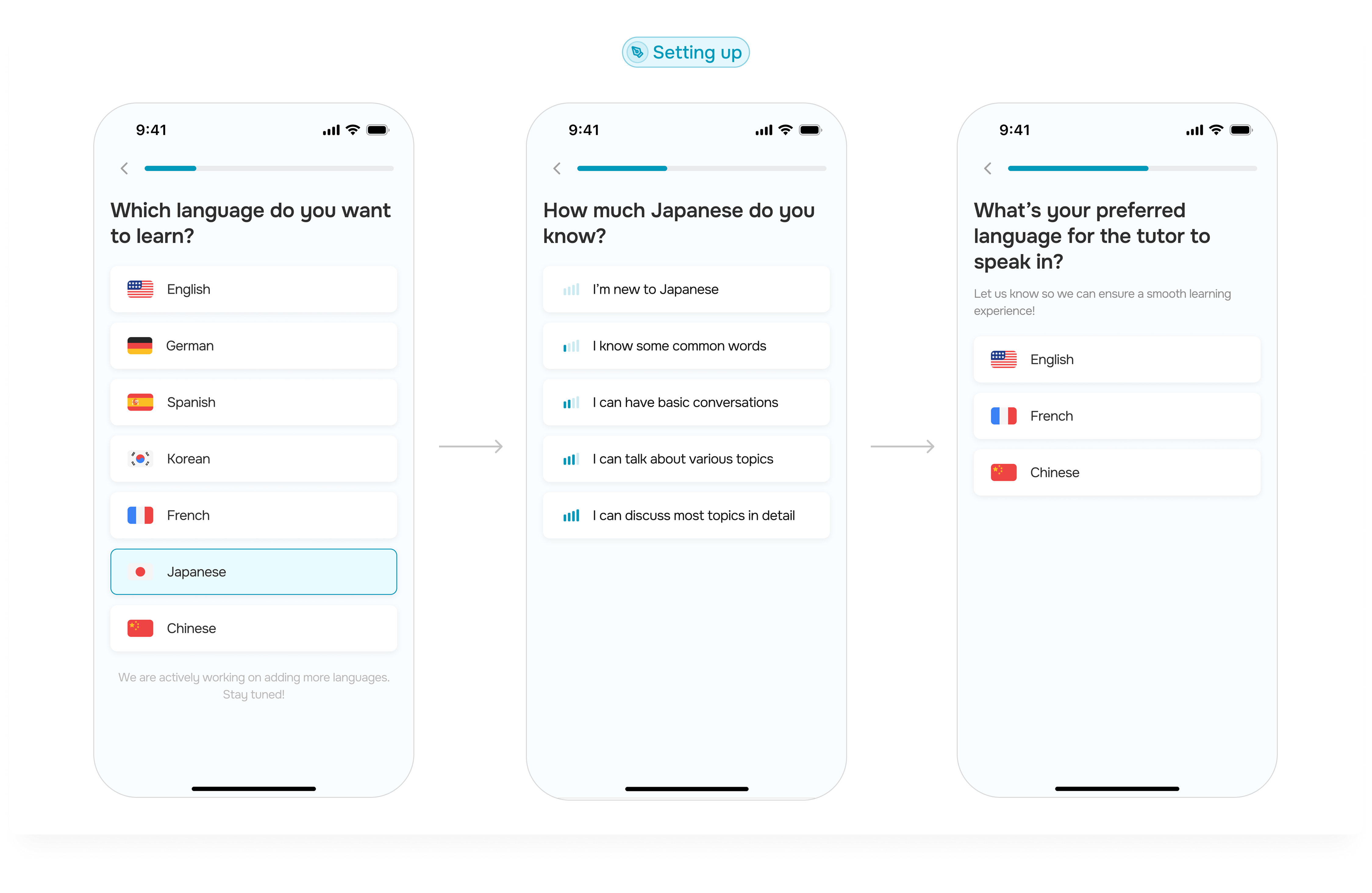
The streamlined setup, which was redefined by the PM, Mauricio Rivero Pooley, now avoids duplicate questions and reduces decision fatigue.
For example, instead of asking users to self-identify their language level and then separately choose courses, we now collect level information once and automatically display only relevant course options that match their proficiency, allowing users to start their language learning journey with minimal friction.

.gif)
Ten is our charming 3D AI tutor that brings learning to life with cute, colorful visuals inspired by Microsoft Fluent Emoji.
Through playful animations, color-changing emotions, and bouncy interactions, Ten creates a fun, engaging educational experience that makes users feel like they're learning from a lively, enthusiastic companion rather than a traditional AI assistant. Working collaboratively with Mauricio Rivero Pooley across several iterations, we developed a 3D style consistent with the redesigned app's overall design language.
Ten introduces itself during setup by asking users to teach it their name pronunciation, a thoughtful solution for Korean, Japanese, Vietnamese, and other names often mispronounced in English.
We have introduced intuitive swiping functionality with clear initial instructions, transforming traditional quizzes into engaging flashcard experiences that reduce learning stress while adding playful interaction.
Most importantly, Ten spontaneously sends surprise messages to users, creating delightful unexpected moments that spark curiosity about what he might say next. These random conversations mirror real-life friendships where friends chat about anything, providing natural daily conversation practice while keeping users motivated and eagerly returning to interact with their AI tutor.
Note: The flashcard concept was designed by another designer (Juna Han) and the PM (Mauricio Rivero Pooley).
We tested two home screen designs with 10 participants:
40%
Increase in perceived professionalism by users
Professionalism:
80%
Increase in perceived youthful energy by users
Youthful Appeal:
Our redesign successfully balanced professionalism with a significantly more youthful, approachable feel which creates a better first impression for users!
As the lead designer, I directed the overall strategy while collaborating effectively with PM, designers, and CEO.
Designed a new AI tutor experience with enhanced interactions that create deeper user connections and make learning more enjoyable.
Redesigned the homepage for better clarity and intuition, helping users quickly understand.
80% increase in perceived youthfulness and 40% boost in professionalism through A/B testing.