Tenmin is an innovative AI language tutor that revolutionizes language learning through real-time conversational practice. It leverages advanced AI technology to provide learners with immediate pronunciation feedback, personalized lesson content, and interactive speaking exercises. Unlike traditional language learning methods, Tenmin focuses on building practical fluency through immersive conversation practice, helping users develop confidence in real-world communication scenarios faster and more effectively.
Our team was working with a CPO who wasn't using components, resulting in completely inconsistent designs. With weekly iterations, each interface looked different from the previous version, and we had no unified design language. Additionally, the founders required a complete visual overhaul to make the app more modern, youthful, and tech-forward. I created a comprehensive design system to establish consistency and align with the company's vision.
No unified design language or standards and lack of standardized design patterns across the team.
Weekly updates and iterations creating visual inconsistency. Each interface iteration looked completely different from the previous ones.
We implemented Brad Frost's Atomic Design methodology to build our design system from the ground up. This approach starts with atoms (colors, typography, icons), combines them into molecules (buttons, form fields), then organisms (navigation bars, cards), templates, and finally pages. This systematic approach allowed us to create reusable components that build upon each other while maintaining consistency and establishing a clear hierarchy that junior designers could easily understand and implement.
We began with atoms—the foundational elements like text variables, color variables, icons, headings, and buttons and then composed them into more complex molecules and organisms to build components.
This systematic, bottom-up approach ensures our components are reusable, consistent, and easy to maintain.
Our design system allows for rapid iteration by leveraging variables and component swapping. The attached GIF illustrates our process of evolving a card component.
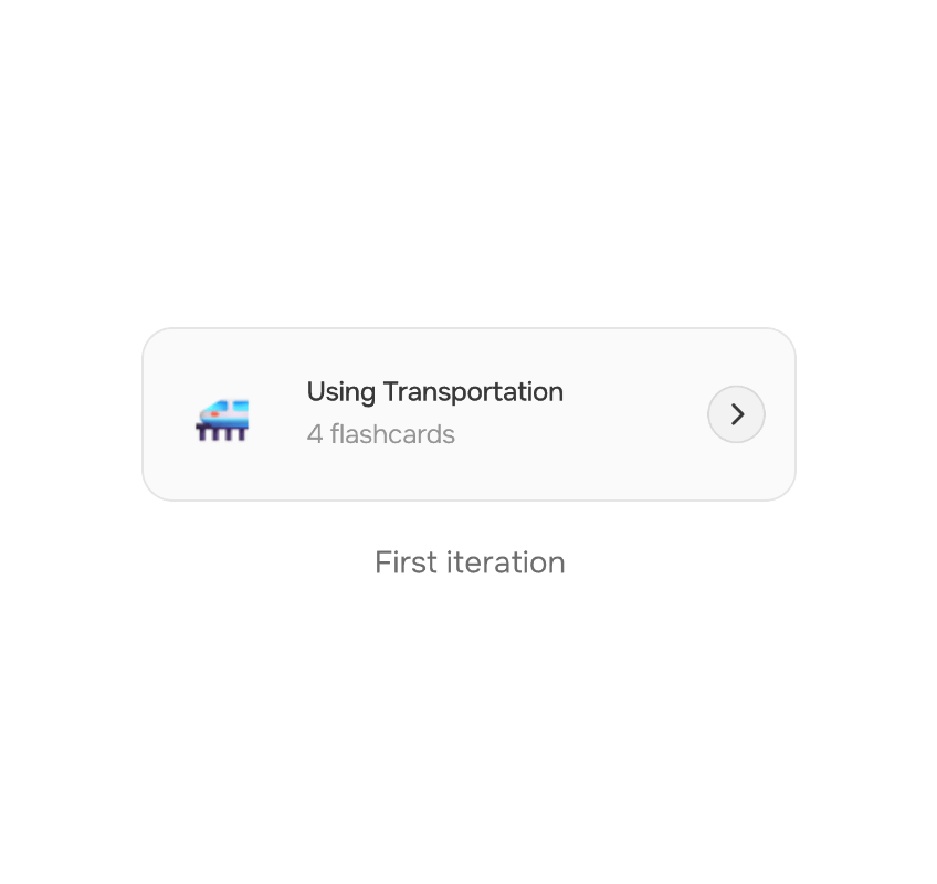
By iterating through multiple versions, I restructured and simplified the design, removing unnecessary information to reduce cognitive load. This focused approach helped guide users more directly toward starting a lesson, which ultimately boosted our conversion rate for lesson completion.
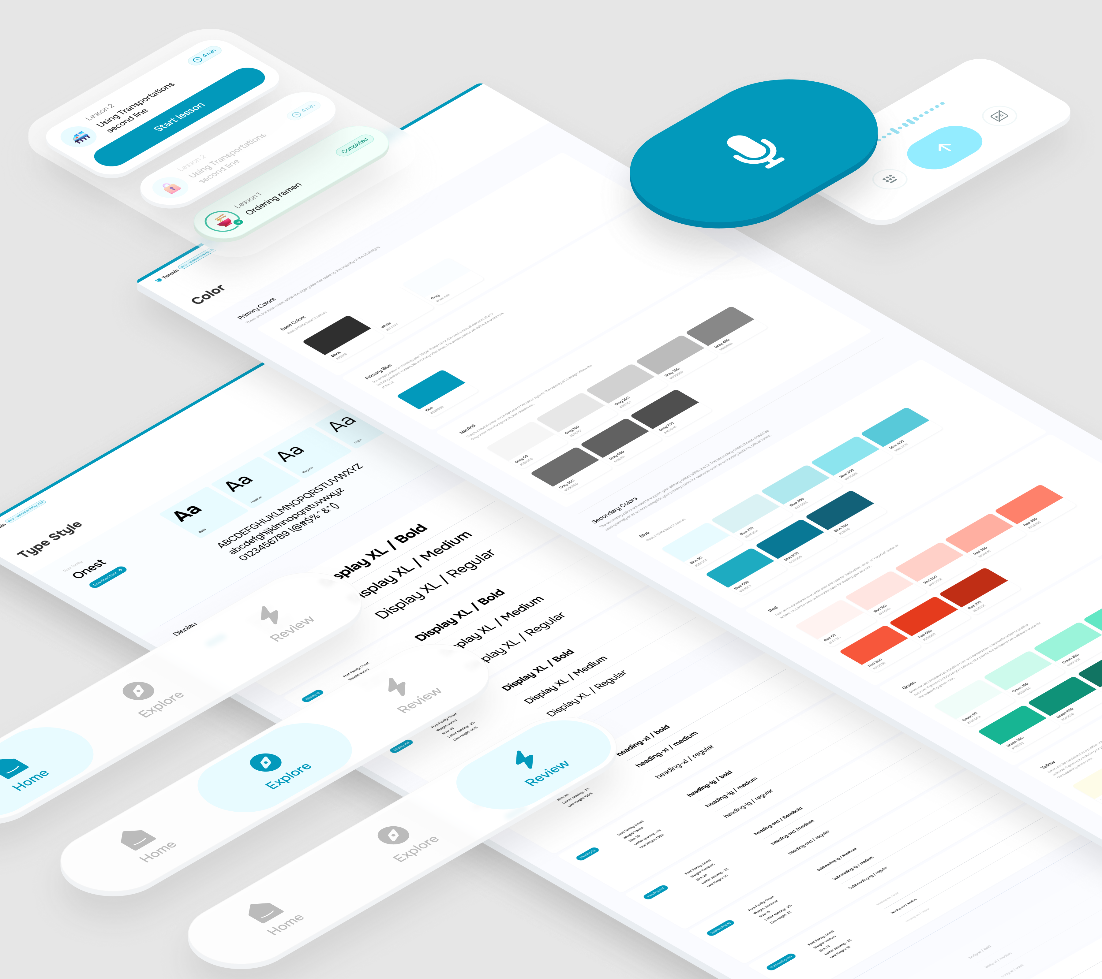
Our mobile-focused design system was designed for rapid updates to match our weekly development cycle. The system features clear naming conventions and intuitive organization, making it easy for junior team members to find and use components. Built with modular architecture, components can be combined and customized while maintaining visual consistency throughout typography, colors, icons, forms, navigation, and layout systems optimized specifically for mobile experiences.
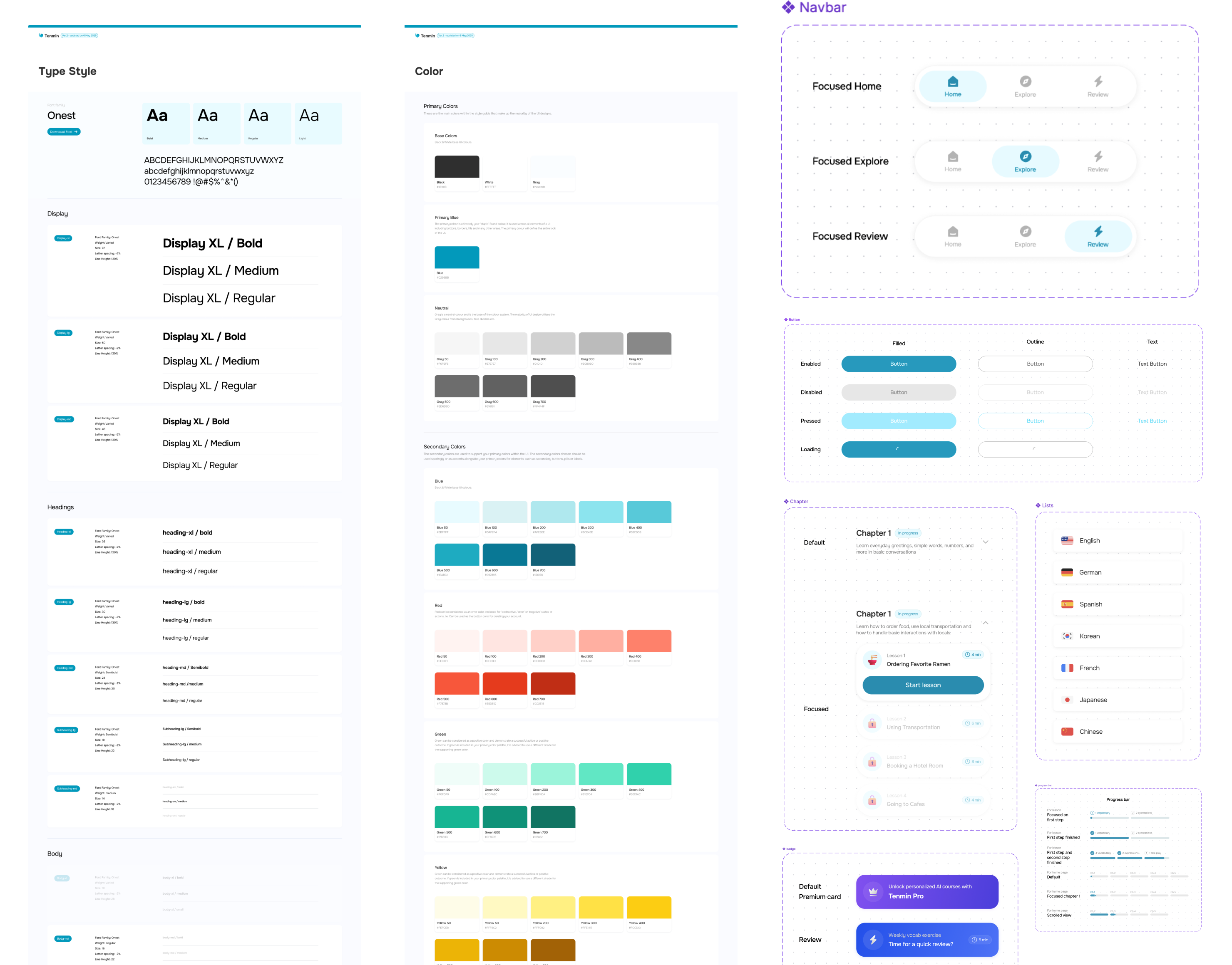
Glimpse of the style guide and master components, there are 50+ components
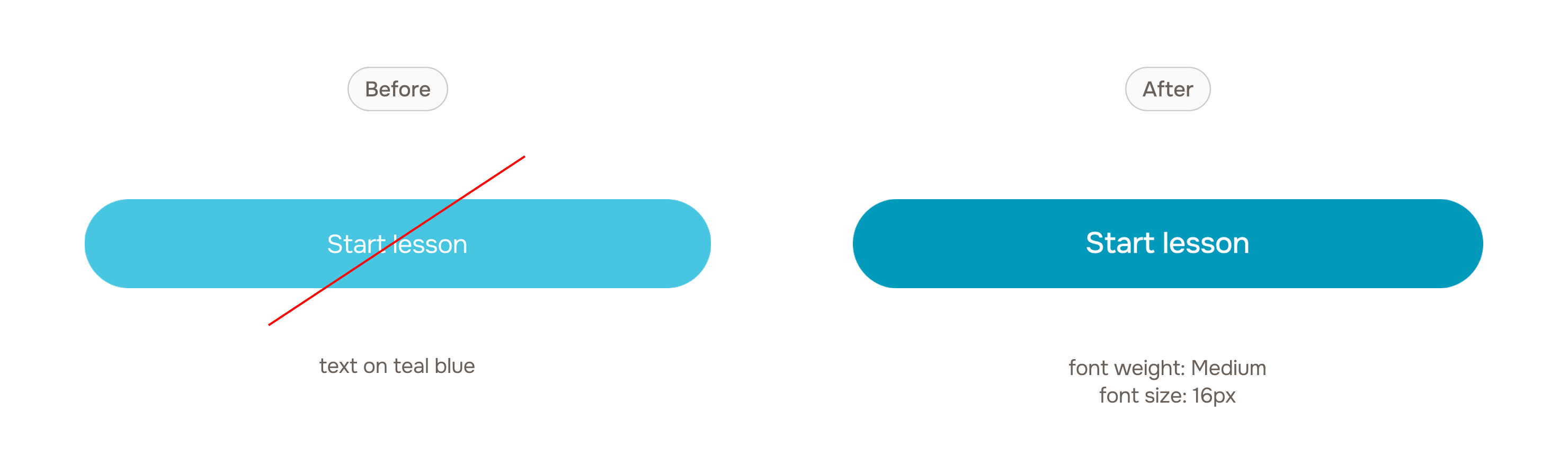
Initial color choices by the CPO failed to meet WCAG 2.1 AA accessibility standards, potentially excluding users with visual impairments. I conducted a comprehensive accessibility audit and redesigned the entire color system to ensure minimum 4.5:1 contrast ratios, while maintaining brand identity. I also enhanced focus states, improved semantic structure, and ensured consistent interaction patterns across all components.
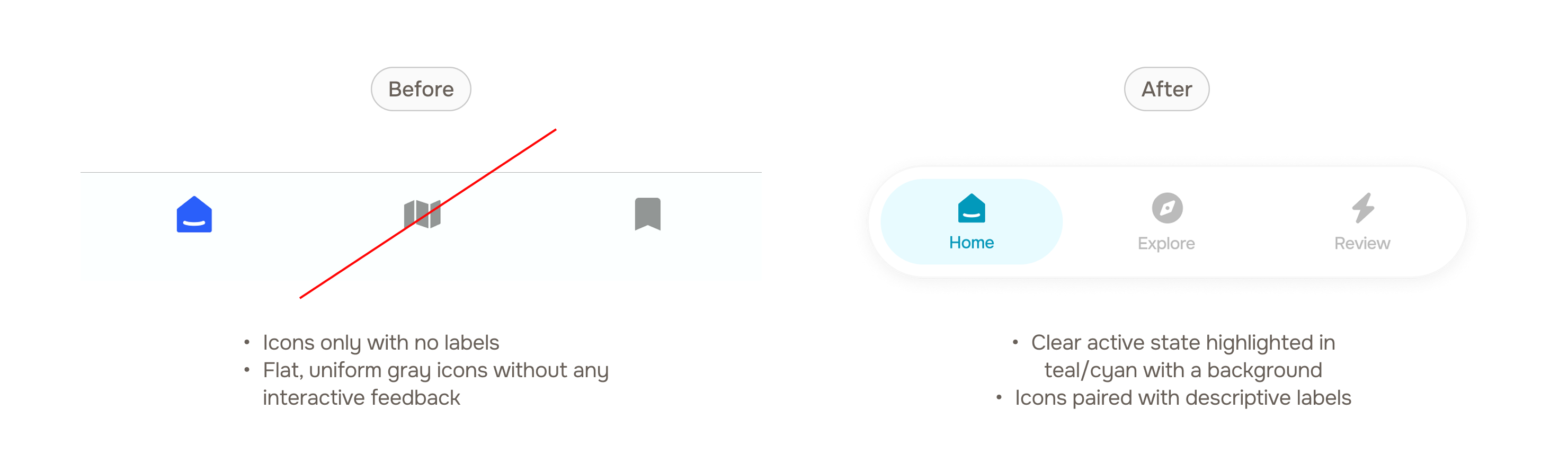
The existing navigation created confusion with unclear page hierarchy and no indication of current location. Users couldn't understand available options or navigate effectively. The redesign focused on creating a clear visual hierarchy by organizing navigation items by importance and frequency of use, implementing clear visual cues that show users their current page location, and adopting contemporary design patterns that align with our updated brand identity.
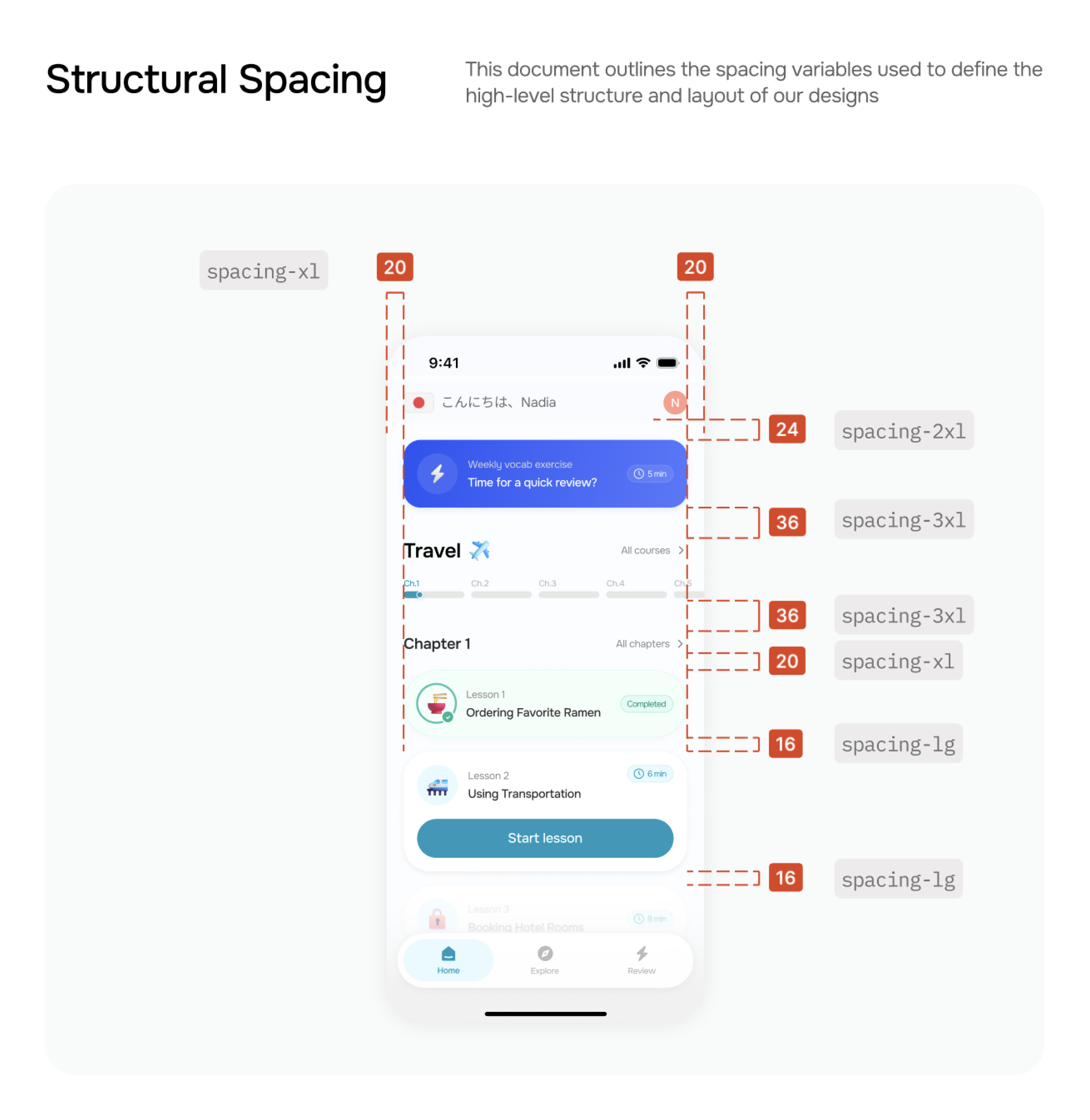
A significant challenge within a design team is the consistent application of design tokens by individuals with varying levels of experience. Junior designers, for example, often face a learning curve in correctly applying variables for elements like spacing and color. To overcome this, I developed a dual-approach documentation system that makes our design foundations, including a 4px base.
Instead of just listing variables, I directly annotate design mockups with the corresponding tokens for spacing as an example below.
This provides a clear, practical guide for new team members to quickly grasp which variables to apply, and it is easier for them to understand the concept of variables.
I also include a more traditional documentation, serving as a foundational reference, it provides a comprehensive breakdown of each variable.
It lists the variable's name, its assigned value, and a brief description of its intended use and now every team member has a reliable source of truth.

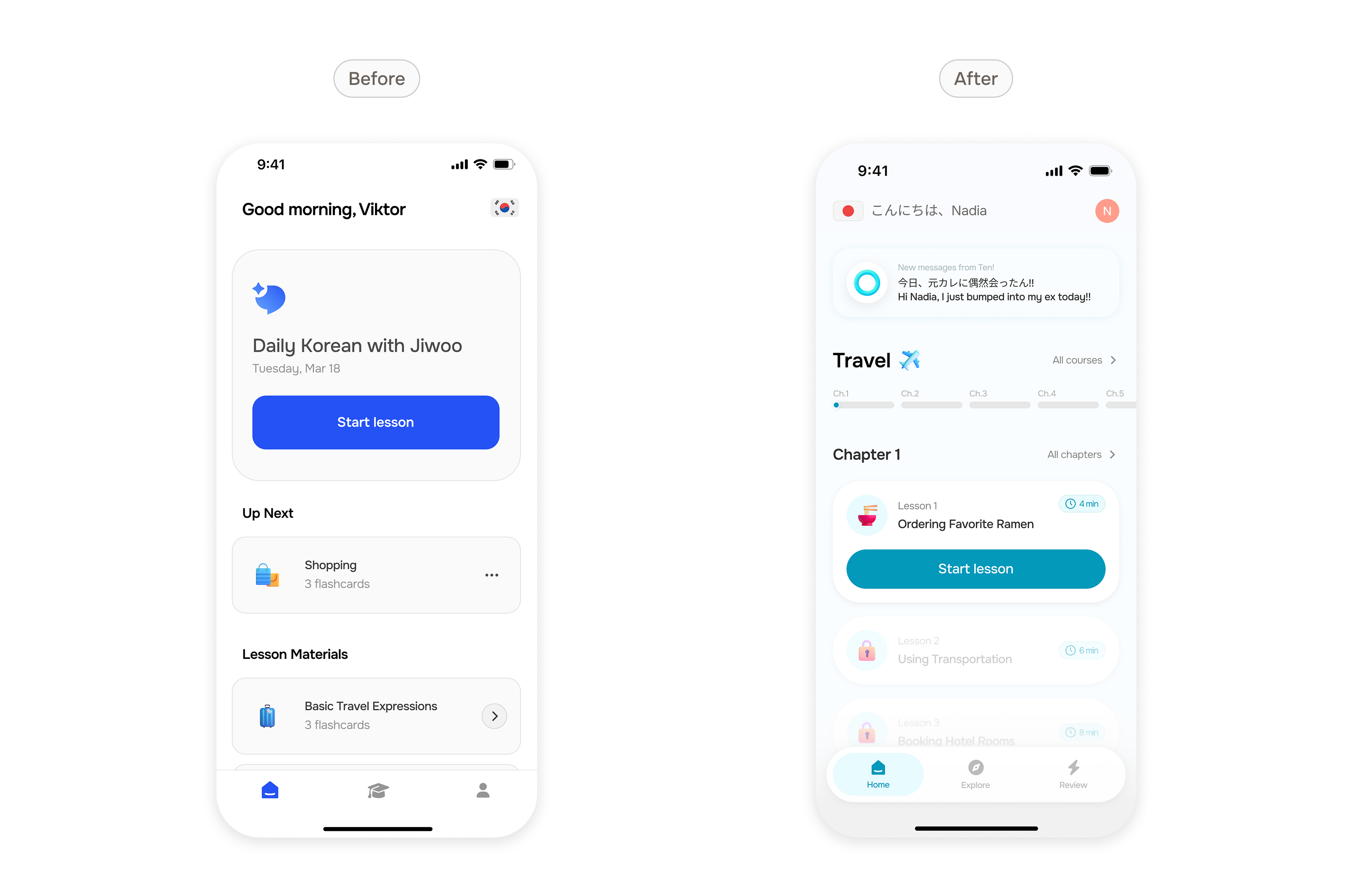
The implementation of our new design system transformed the entire Tenmin app experience. With the new components, the app is now cleaner, more structured, and more intuitive for users to navigate. The systematic approach eliminated visual clutter and established clear information hierarchy throughout all interfaces.
More importantly, the redesigned app successfully meets all requirements from the founders. The updated visual language achieves the desired modern aesthetic while appearing more youthful and energetic. The professional polish elevates the brand perception, while the approachable design ensures users feel comfortable engaging with the AI tutor.
I went all-out creating detailed prototypes in Figma and using After Effects for practically every interaction we dreamed up. Talk about attention to detail: Prototype showcasing various scroll transitions and effects for developer hand-off.
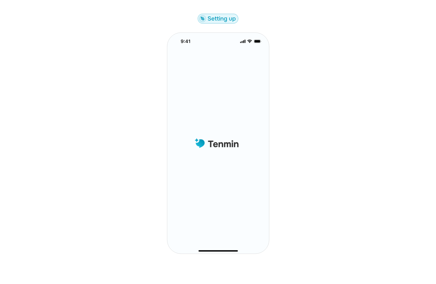
An example as above for the first-time user to set up their profile and courses
Results
Learnings