
Can't spill the details of what I worked on (hello NDA!), but here's a peek into the approaches and aspects I have worked on ✨
The primary objective was to transition the SiGREEN design system from Adobe XD to Figma. This involved not only migrating existing components but also addressing key structural issues that hindered our workflow. The previous system suffered from two main problems:
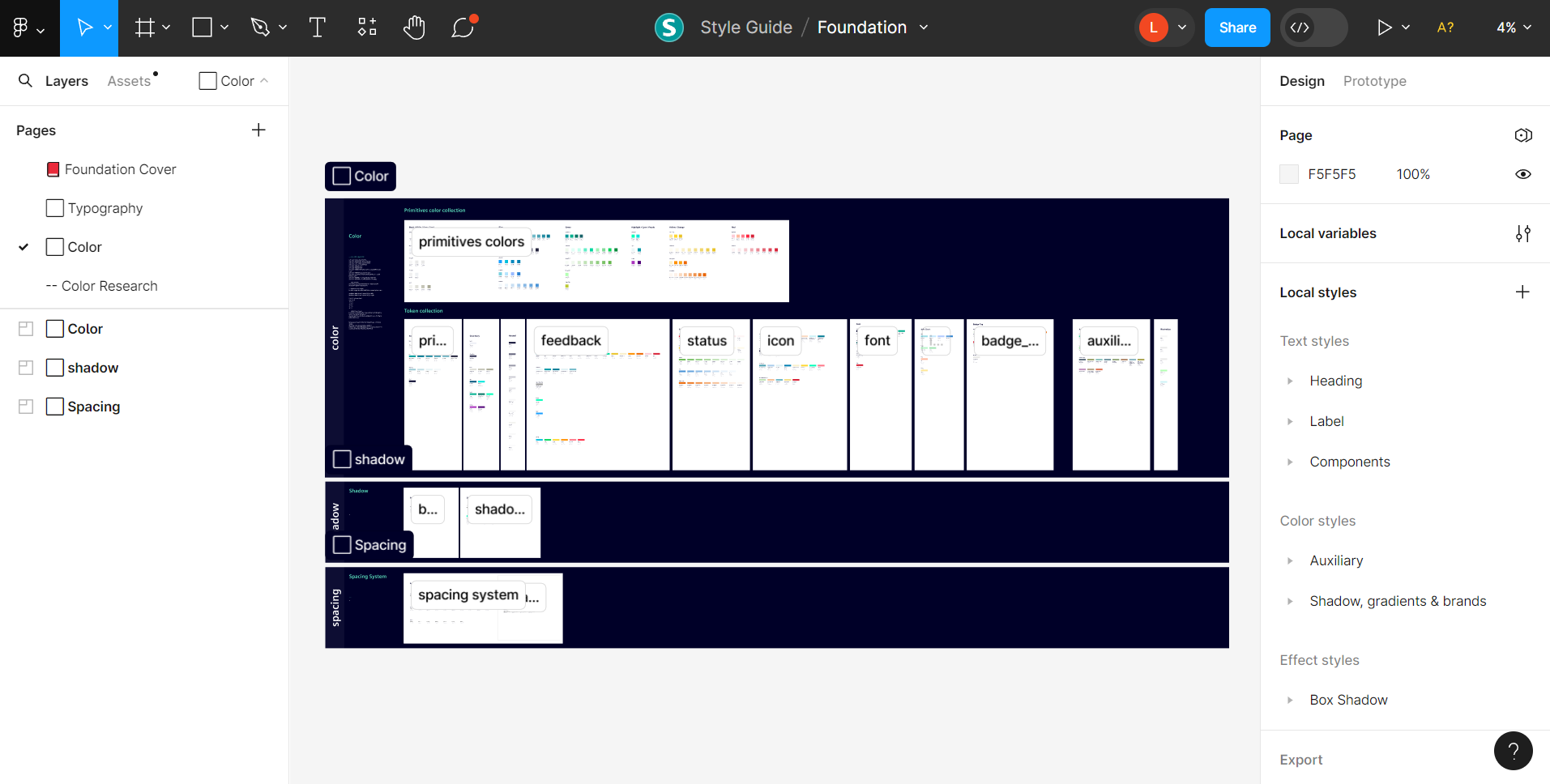
The design system’s guidelines were stored in a single, static PDF file. This made it extremely difficult for the team to access, search, and follow the latest design rules, creating a major roadblock for collaboration
The detached instances caused a ripple effect of misalignment and visual errors throughout our designs, forcing designers to make time-consuming manual fixes and increasing the risk of inconsistencies

We employed design tokens as containers for values, liberating both designers and engineers from the constraints of hex color codes. This allows designers to seamlessly switch colors without impacting other design elements, facilitated by the utilization of both Option Tokens and Alias Tokens. Our decision to adopt Design Tokens was further motivated by their capacity for referencing and reusing values, enhancing efficiency and consistency within our design system
As such, my responsibilities include developing design tokens that can link to pre-existing values or color codes
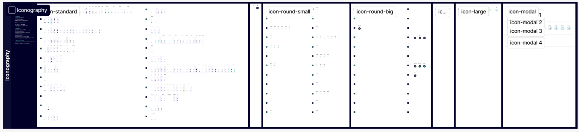
Regarding icons, our team's primary objective is to ensure effortless swapping for all users, not just the design team, without the need to navigate the icon structure to modify colors. Once an icon is swapped, its color remains consistent. The initial issue with our iconography was that when swapping icons, certain parts would display different colors than intended
Therefore, my tasks and responsibilities involve researching optimal practices for managing various icon sizes and default colors. Additionally, I am responsible for organizing each icon's structure based on vectors, outlines, or fills, and when necessary, recreating icons to address these challenges
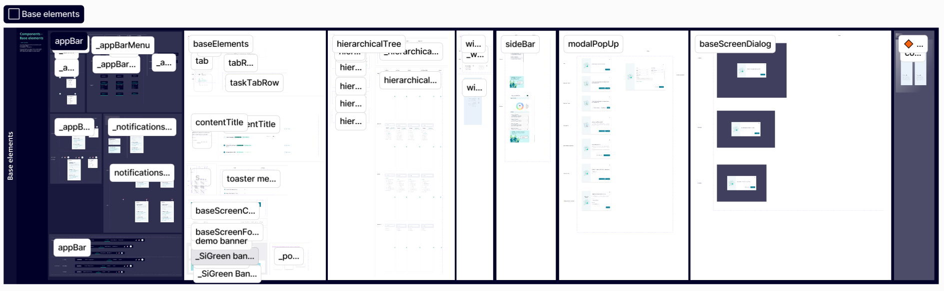
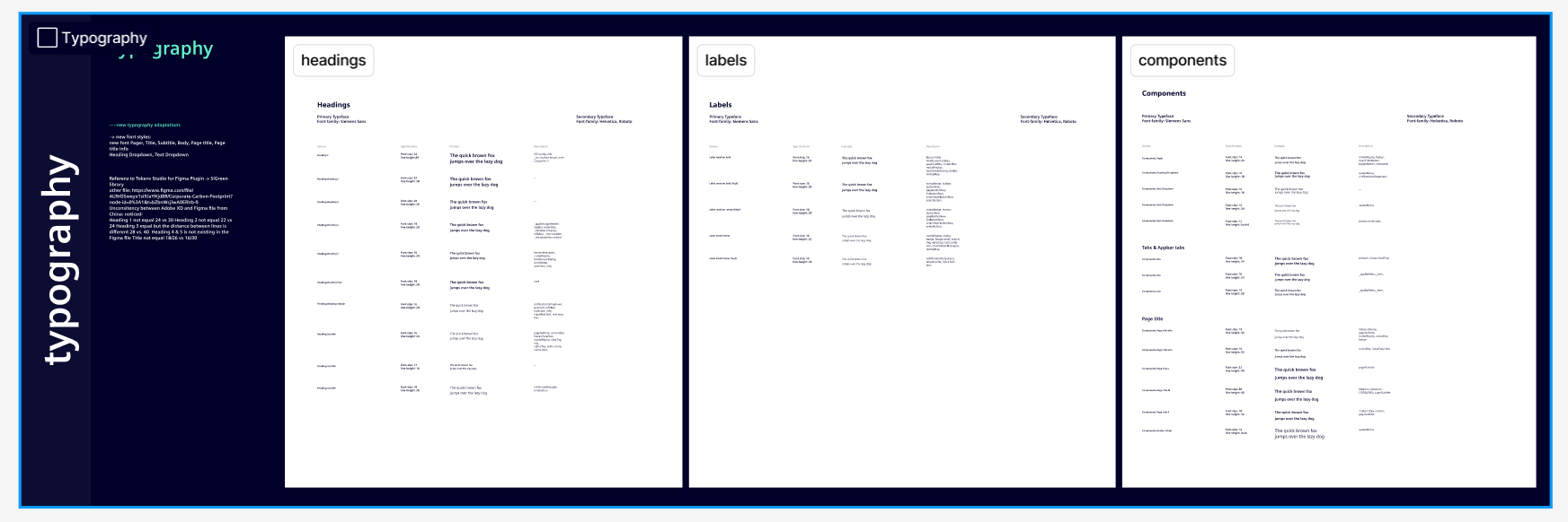
Numerous components, such as Base Elements and form controls, were still in development. My responsibilities involve working with the design team in Austria to recreate these components and conduct thorough quality checks on all aspects, including paddings, margins, colors, and finer details
I particularly focus on the naming of each component and assessing the scalability of each component to prevent issues like overflowing or lack of scalability when these assets are utilized in future designs
By rigorously managing and structuring this new design system in Figma, our teams can now collaborate more efficiently. It has created a single source of truth that aligns both design and development, saving time, reducing costly errors, and significantly accelerating the iteration cycle. This has freed up resources, allowing us to focus on higher-impact projects and deliver value to our users faster