
Can't spill the details of what I worked on (hello NDA!), but here’s a peek into some shareable aspects and approaches I contributed to ✨
The primary objective was to transition the SiGREEN design system from Adobe XD to Figma. This involved not only migrating existing components but also addressing key structural issues that hindered our workflow. The previous system suffered from two main problems:
The design system’s guidelines were stored in a single, static PDF file. This made it extremely difficult for the team to access, search, and follow the latest design rules, creating a major roadblock for collaboration.
A disorganized and inconsistent system and icon library led to a fragmented experience. Designers wasted time searching for the right icon and then had to make time-consuming manual fixes, as changing the color on a single icon would only partially update the graphic, leading to visual errors and brand inconsistencies.
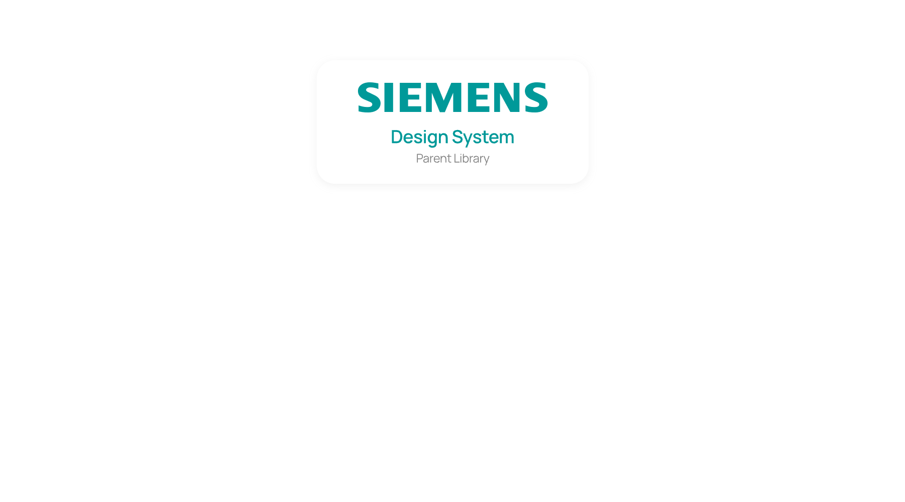
A key aspect of this project was operating within a larger organizational ecosystem. The SiGREEN design system serves as a "child library," which inherits and extends components from the main "parent library" of Siemens. This required a new level of governance to ensure that while we customized components for our product's specific needs, we maintained a consistent and harmonious relationship with the foundational design system.
Migrating from Adobe XD, our first step was meticulously recreating the color and typography systems in Figma. Despite using automation tools, we had to manually verify every single component to correct migration errors, guaranteeing a flawless foundation before moving on to design tokens.
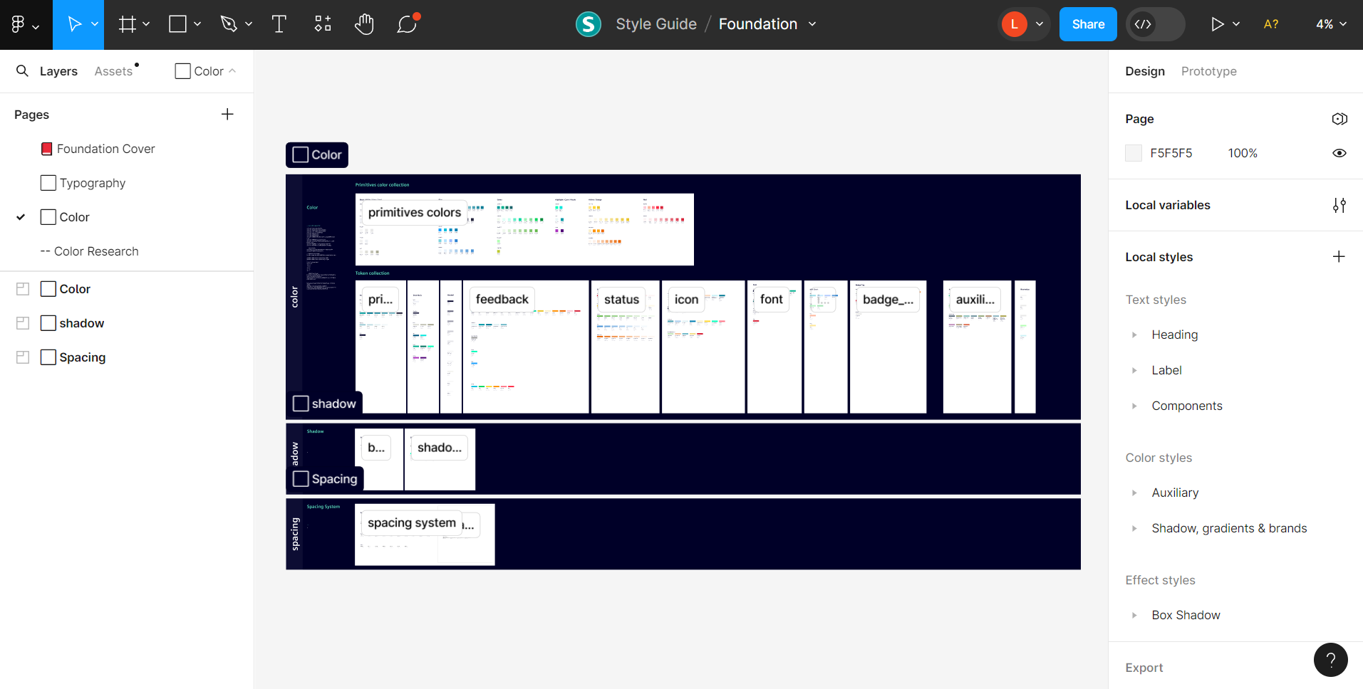
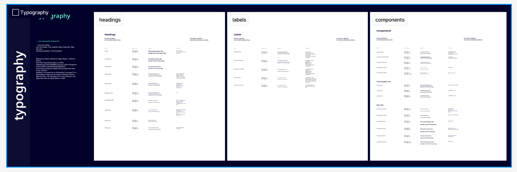
A glimpse into the documentation for our color and typography systems
We employed design tokens as containers for values, liberating both designers and engineers from the constraints of hex color codes. This allows designers to seamlessly switch colors without impacting other design elements, facilitated by the utilization of both Option Tokens and Alias Tokens. Our decision to adopt Design Tokens was further motivated by their capacity for referencing and reusing values, enhancing efficiency and consistency within our design system.
As such, my responsibilities include developing parts of design tokens and conducting thorough quality checks that can link to pre-existing values or color codes.
A major hurdle for our team was the disorganized icon library. Icons lacked a consistent structure, which created significant issues when designers tried to swap them out. When an icon was replaced, its color often failed to update automatically, leaving parts of the new icon with the old color and forcing designers into time-consuming manual fixes. Our goal was to create a system where anyone could swap an icon and its color would change effortlessly, ensuring brand consistency.
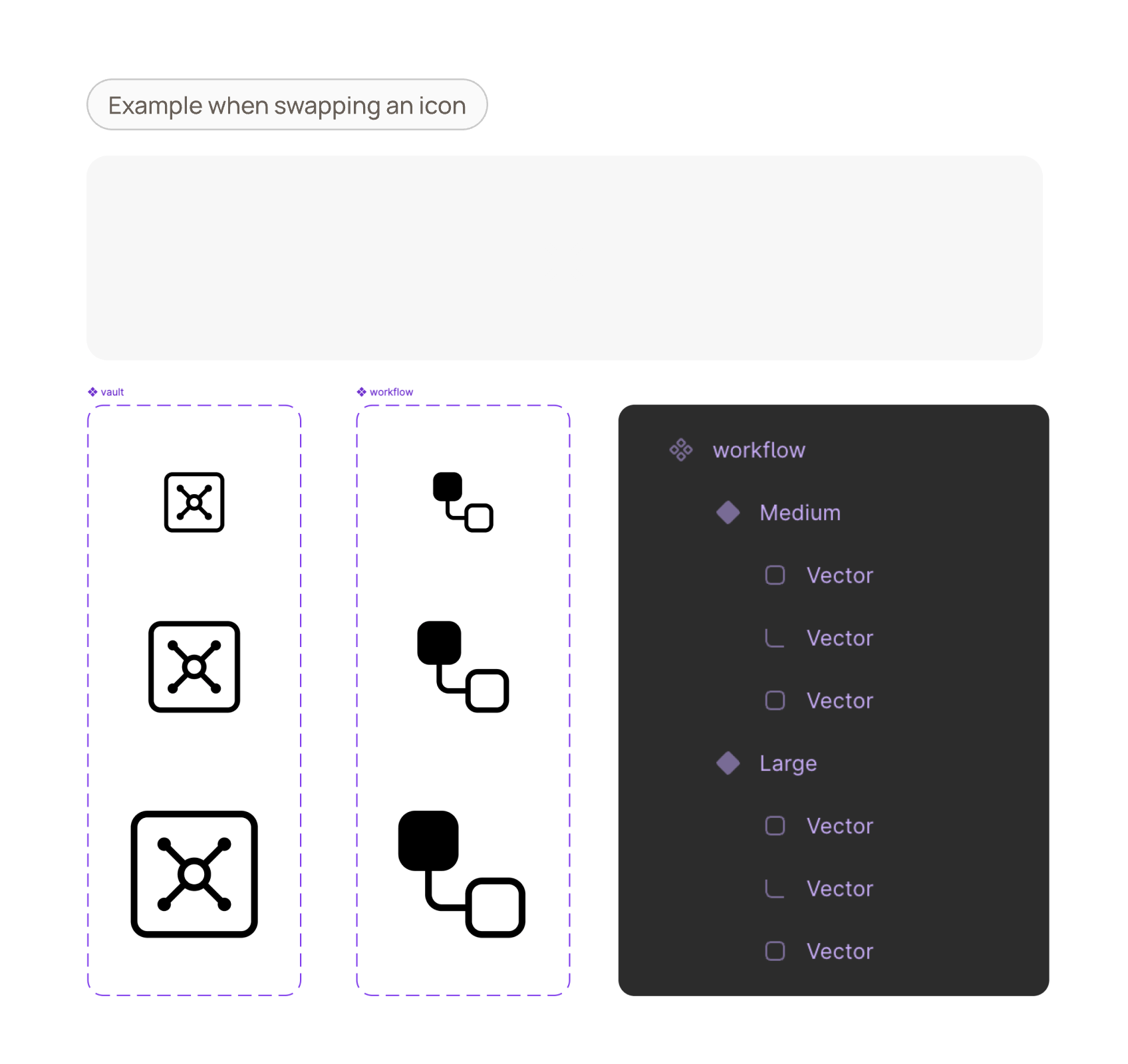
To solve this, my role was to research and implement best practices for managing icons. I focused on standardizing the structure of each icon's vector layers. This involved ensuring all icons followed the same naming conventions, for example, grouping all stroke elements under a layer named "strokes" and all filled areas under a layer named "fills." By standardizing the structure and naming, when an icon is swapped, Figma can correctly apply the new color across all parts of the icon.
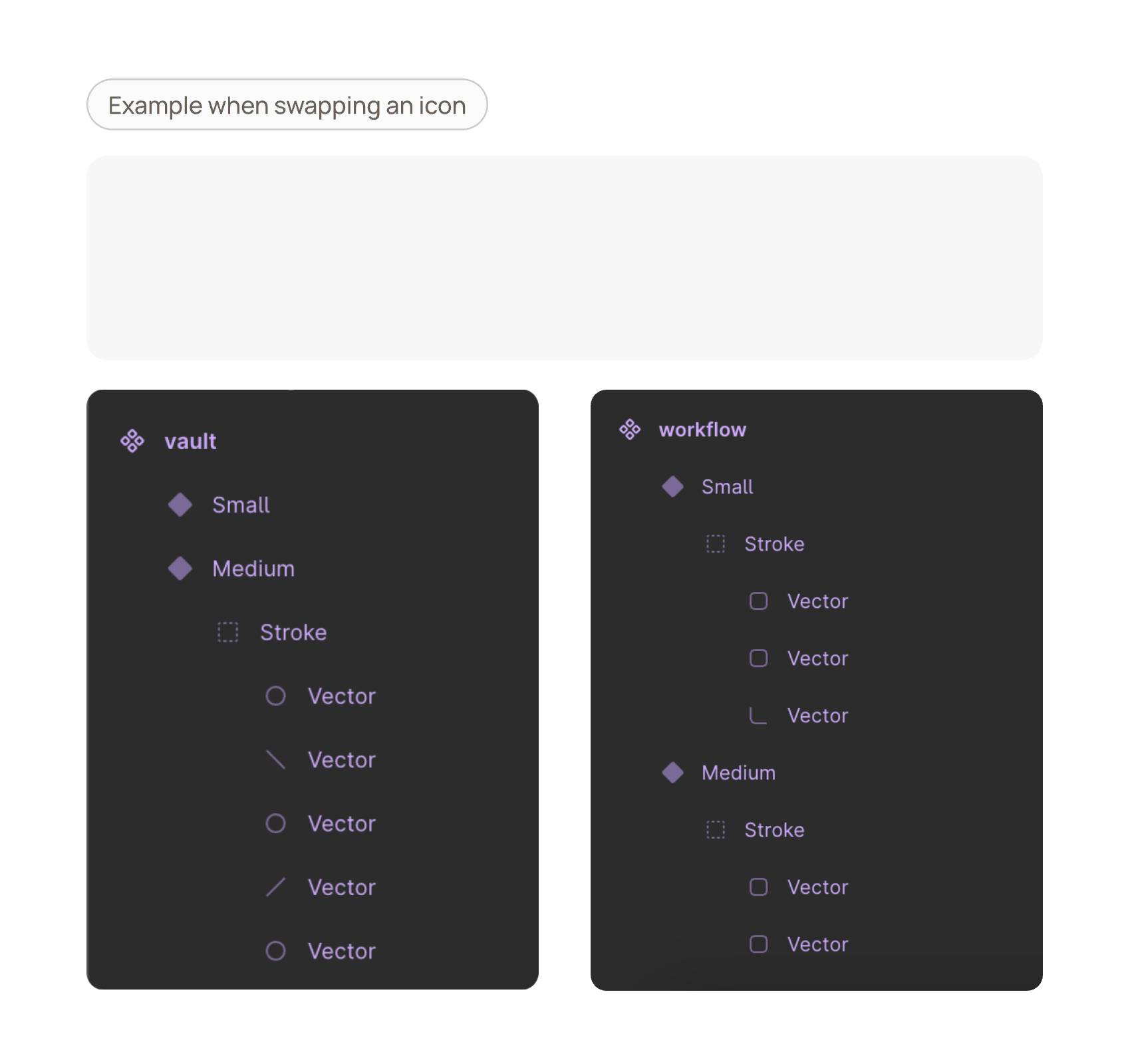
Second, I meticulously sorted over 150 icons alphabetically and organized them into logical categories. This simple change drastically improved the user experience for our designers, eliminating the time previously wasted on searching and making our entire icon library intuitive and scalable.
Restructuring over 150 icons for improved organization and scalability
Numerous components, such as Base Elements and form controls, were still in development. My responsibilities involve working with the design team in Austria to recreate these components and conduct thorough quality checks on all aspects, including paddings, margins, colors, and finer details.
I particularly focus on the naming of each component and assessing the scalability of each component to prevent issues like overflowing or a lack of scalability when these assets are utilized in future designs.
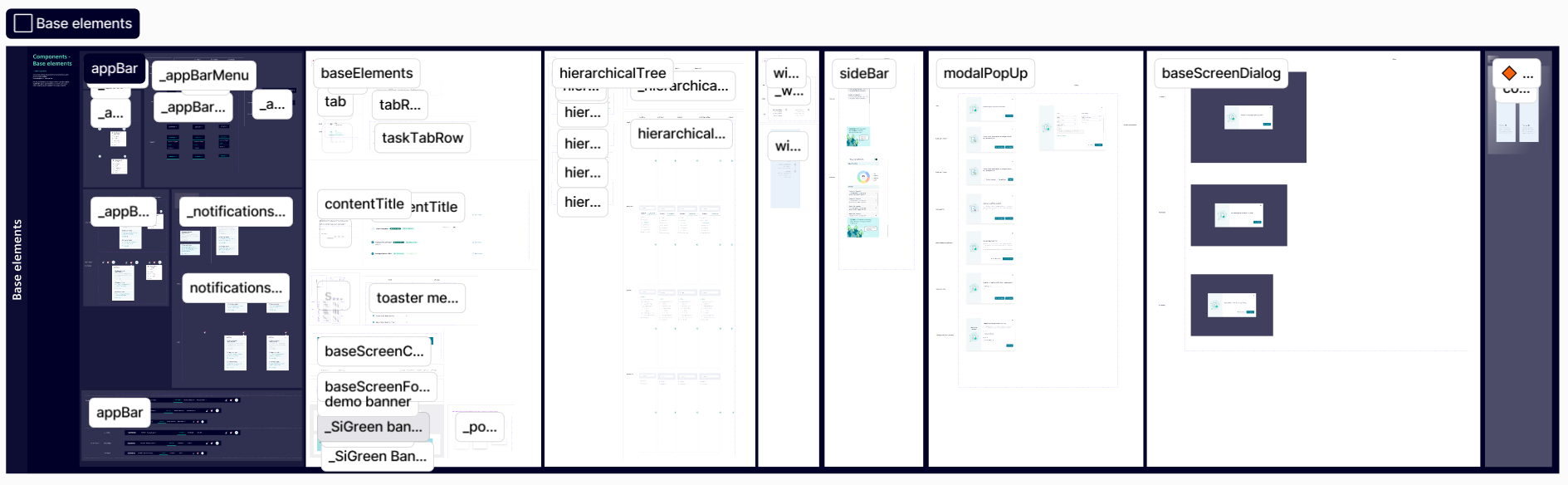
A glimpse into my quality assurance work on over 100 base components
Results
By rigorously managing and structuring this new design system in Figma, our teams can now collaborate more efficiently. It has created a single source of truth that aligns both design and development, saving time, reducing costly errors, and significantly accelerating the iteration cycle.